When creating a responsive web interface—especially for mobile—you often run into a frustrating issue: the viewport height (100vh) doesn’t always behave as expected. The address bar disappears, the keyboard pushes everything upward… Sound familiar? Good news: CSS has introduced new units to better handle this behavior!
In this article, we’ll explain the svh, lvh, and dvh units—their differences, use cases, and why they’re a game-changer for responsive design on mobile.
📏 Quick Reminder: What Does 100vh Do?
The vh unit (viewport height) represents 1% of the height of the browser window. So, 100vh is supposed to represent 100% of the visible height of the page.
👉 But on mobile, the height of the window can vary depending on the user interface: the appearance of the keyboard, scrolling that hides or shows the address bar, and so on. The result? 100vh doesn’t always represent what you think it does.
✨ The New Units: svh, lvh, and dvh
To address the recurring issues with viewport height on mobile, CSS introduced three new units: svh, lvh, and dvh. Each represents a different approach to calculating the height of the window and offers greater precision depending on the situation.
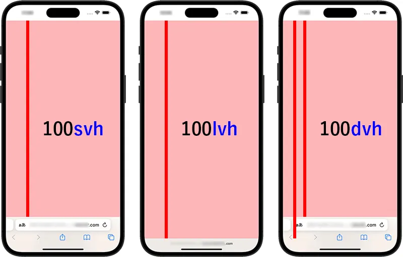
The svh unit (Small Viewport Height) represents the smallest possible height of the viewport, usually when interface elements like the address bar or the virtual keyboard are visible. It’s useful to ensure that content remains visible even in the most constrained display scenarios. For example, if a user opens a keyboard, an element set to 100svh will stay within the visible area, avoiding hidden content or unwanted scrolling.
.container {
  height: 100svh;
}
On the other hand, lvh (Large Viewport Height) refers to the maximum possible height of the viewport, meaning when all browser UI elements are hidden. This unit is ideal for creating full-screen sections or immersive layouts. Using 100lvh allows you to leverage the full potential space of the screen, especially after the user scrolls and the address bar collapses.
.fullscreen {
  height: 100lvh;
}
Lastly, dvh (Dynamic Viewport Height) is a unit that reflects the current height of the viewport in real time. Unlike svh and lvh, it changes dynamically based on the state of the interface. This makes it perfect for designing adaptive layouts that automatically respond to changes, such as the appearance of the keyboard or the collapse of the navigation bar. It offers an excellent balance between flexibility and control.
.section {
  height: 100dvh;
}
✅ Compatibility
The svh, lvh, and dvh units are already supported by modern browsers:
- ✅ Chrome 108+
- ✅ Safari 15+
- ✅ Firefox 109+
🛑 For older browsers, it’s recommended to include a fallback using vh:
height: 100vh;
height: 100dvh;
🚀 Conclusion
With svh, lvh, and dvh, CSS finally solves a long-standing problem in responsive mobile design: reliably managing screen height.
These units allow you to create smoother, more robust interfaces—without relying on JavaScript hacks and without unexpected layout shifts when the keyboard appears or disappears.
Adopt them today to build more modern and stable mobile designs!