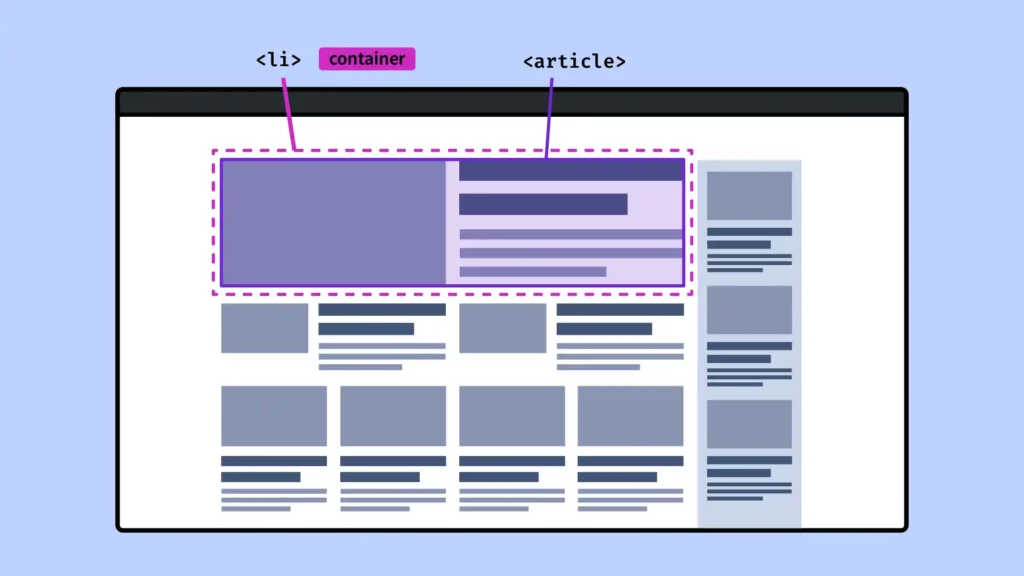
When we think of responsive design, the first thing that comes to mind is @media. But with the arrival of Container Queries, a new era begins: one where components can adapt their style based on their own container’s size, not just the size of the screen.
In this article, we’ll explore the CSS @container rule and see how it’s changing the way we build interfaces.
Why @media Isn’t Always Enough
Traditionally, we use Media Queries like this:
@media (min-width: 768px) {
  .card {
    flex-direction: row;
  }
}
But this style only applies if the entire viewport is large enough — not if just the component itself has room.
👉 The problem: in layouts with many sections, some might be wide, others narrow… and we want each component to be self-aware and responsive to its own container, not the whole screen.
🎯 The Solution: @container
With Container Queries, we can write styles that depend on the size of a container, not the viewport.
@container (min-width: 500px) {
  .card {
    flex-direction: row;
  }
}
This means: “If the parent container of .card is at least 500px wide, apply this style.”
How It Works
1. Declare a Container
Before using @container, you must define which element is a container:
.container {
  container: inline-size;
}inline-size: tracks the width only.size: tracks both width and height.
📝 Note: a container cannot be
display: inline. Useblock,flex, etc.2. Apply Conditional Styles with
@container@container (min-width: 600px) { .box { font-size: 1.5rem; } }Complete Example
<div class="container">
  <div class="card">
    <p>Hello!</p>
  </div>
</div>
.container { container: inline-size; width: 100%; max-width: 800px; } .card { display: flex; flex-direction: column; } @container (min-width: 600px) { .card { flex-direction: row; } }
Result: .card only switches to row layout if its .container is wider than 600px — regardless of the viewport size!
Conclusion
With @container, we move from global responsiveness to local responsiveness. Each component becomes truly modular and adapts to its own context. It’s a big leap forward in building flexible, reusable design systems.
So… ready to move beyond @media? 😉


